






































Pakistan’s Poverty Graph Is Not a Talking Point. It Is a National Charge Sheet.
The most dangerous thing about Pakistan’s poverty graph is not that poverty has risen again; the dangerous thing is that our political class still thinks the poor exist only as campaign footage, budget footnotes, and moral decoration for television speeches. A graph showing provincial poverty trends should have triggered a serious national emergency, yet the conversation immediately collapsed into the same old circus: who ruled when, who inherited what, who ruined what, and who has the audacity to lecture whom after sitting inside the very machine that helped manufacture this decline.
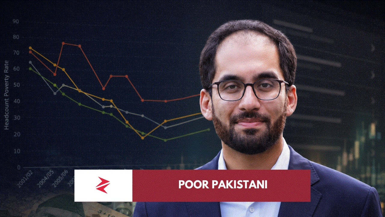
The graph shared in the current debate, reportedly first posted by LUMS economist Ali Hasanain and later amplified by Miftah Ismail, shows a long provincial story of poverty reduction followed by a visible reversal after the mid-to-late 2010s. The user-supplied graph defines poverty as income below roughly Rs 8,500 per month per person and places about 30% of Pakistanis below that line, while the latest World Bank country profile separately shows Pakistan’s poverty rate at $3.00 a day, 2021 PPP, at 22.96% in 2024. These figures are not identical because poverty lines and methodologies differ, but the direction is not hard to understand: Pakistan had reduced poverty dramatically over earlier decades, and that progress has now stalled, reversed, or become fragile depending on which lens one uses.
The attached graph itself tells a sharper political story than the caption attached to it. Punjab, Sindh, KPK, and Balochistan all show a large fall from the early 2000s toward 2015/16 or 2018/19, but the last plotted point for 2024/25 bends upward in every province. That means one cannot honestly pretend Pakistan is still riding the same poverty-reduction momentum it had earlier. At the same time, one also cannot casually say poverty has simply been “increasing everywhere since 2015/16” without admitting that Punjab and Sindh appear to keep falling until 2018/19 in the graph, while KPK’s reversal seems to begin earlier and Balochistan’s poverty remains structurally higher and more volatile. The honest reading is this: the graph shows a pre-2018 poverty reduction phase, then a national reversal phase, with different provincial timing and different provincial severity.
Approximate visual reading from the attached graph:











AI Music Generator
May 27, 2026 at 5:15 am
One thing that stood out is how poverty trends can look encouraging on paper while still masking deep regional and structural differences. It would be interesting to see more discussion around whether the improvements Ali Hasanain highlights are being driven by sustainable factors like productivity and jobs, or by short-term shifts that may not hold over time.
Zorays
May 29, 2026 at 9:35 pm
Thank you for your comment. I appreciate your thoughts on this topic.