














































| Sensory variable | Intended mental response | Possible creative test | Primary measurement |
|---|---|---|---|
| Product orientation | Ease of imagined use | Left-facing versus right-facing object | Click-through rate, add-to-cart rate |
| Texture visibility | Imagined touch and quality | Wide product shot versus close texture detail | Product-page visits, engagement time |
| Colour temperature | Warmth, urgency or calm | Warm palette versus cool palette | Conversion rate, recall survey |
| Motion rhythm | Energy or ease | Rapid cuts versus smooth movement | Video completion, landing-page action |
| Visual spacing | Simplicity and confidence | Dense layout versus open layout | Bounce rate, message comprehension |
| Perspective | Personal involvement | Catalogue view versus first-person view | Purchase intent, interaction rate |
| Sound design | Recognition and emotional tone | Product sound versus generic music | Completion rate, brand recall |
| Cultural cue | Familiarity and relevance | Generic environment versus local context | Segment-level response |
The most important rule is isolation. Do not change the spoon orientation, headline, colour, price and call to action simultaneously and then claim that sensory marketing worked. Change one meaningful variable, distribute the versions fairly, give the test enough time and judge it against a commercial outcome.
Click-through rate can reveal attention, but not necessarily persuasion. Add-to-cart rate may show stronger product interest. Completed purchases reveal commercial performance. Brand recall surveys can determine whether the sensory pattern stayed in memory. Heat maps may show whether the eye followed the intended hierarchy.
The metric must correspond to the claim.
Recognition, Difference and Invitation
A high-performing sensory advertisement generally balances three forces.
Recognition allows the viewer to understand what is being shown without unnecessary effort. Difference prevents the advertisement from disappearing into the surrounding feed. Invitation creates an unresolved question or an imagined interaction that encourages the viewer to remain.
Recognition without difference produces a competent but forgettable advertisement. Difference without recognition produces confusion. Recognition and difference without invitation may win a moment of attention but generate no action.
The advertiser’s task is therefore not to maximise intensity. It is to create controlled tension.
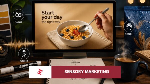
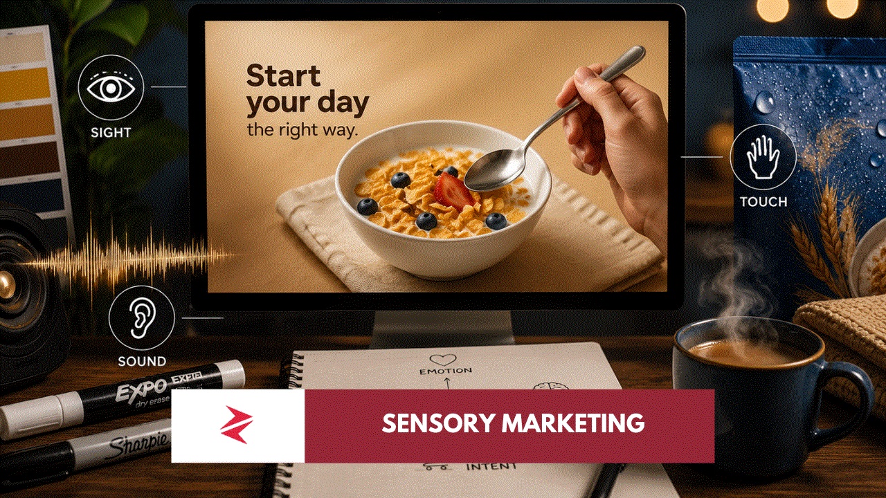
A premium watch advertisement does not need explosions, five benefits and a red purchase button. The weight of the metal, the detail of the dial, the reflection across the surface and the angle of the wrist may do more persuasive work than the copy. A food advertisement does not need to declare that the meal is delicious when steam, texture, colour and utensil placement have already made the viewer imagine the first bite.
Great sensory design does not describe every quality. It gives the mind enough evidence to complete the experience itself.
What Nobody Tells Marketers About Sensory Advertising
The hidden weakness in many sensory-marketing discussions is the assumption that adding more sensory cues necessarily creates a stronger advertisement. It does not.


Sensory cues must reinforce the same message. Soft lighting paired with aggressive typography creates conflict. Luxury positioning paired with crowded discount stickers destroys the intended atmosphere. Slow, elegant movement interrupted by loud generic music fractures the experience. A beautiful product photograph oriented awkwardly for interaction may look polished while quietly reducing mental fluency.
The consumer may not articulate any of this. They will simply feel that the advertisement is wrong.
This is also why blindly copying an international campaign is risky. Sensory associations are shaped by context, memory, language, climate, cultural rituals and previous brand exposure. A colour, sound or domestic setting associated with comfort in one market may carry no emotional weight in another. Pakistani advertising becomes more powerful when it understands the lived sensory vocabulary of Pakistan rather than borrowing every visual instinct from Dubai, London or New York.
Anarkali Bazaar, Lahore’s roadside tea culture, Eid shopping, monsoon streets, wedding fabrics, truck-art colour, cricket sounds and household product rituals are not merely decorative local references. Used intelligently, they are stores of sensory memory.
Used lazily, they become clichés.
Sensory Marketing Must Support Truth, Not Replace It
Sensory marketing can increase attention and purchase intention, but it cannot permanently rescue a weak product. A visually rich food advertisement will deepen disappointment when the delivered meal bears no resemblance to the image. Premium packaging may generate an initial perception of quality, but repeated product failure will rewrite that association.
The ethical and commercial rule is straightforward: sensory design should make a genuine product quality easier to perceive, not fabricate a quality that does not exist.
The strongest brands align the sensory promise with the delivered experience. The advertisement suggests smoothness, and the application is genuinely easy to use. The packaging communicates durability, and the product survives real use. The restaurant advertisement conveys freshness, and the meal arrives fresh.
Trust is built when the sensory prediction is fulfilled.
