


The debate has moved beyond the name. It has matured, widened, and sharpened. What began as resistance to “Houston” has now folded in symbolism, optics, and trust—because the logo reveal changed the temperature of the room.
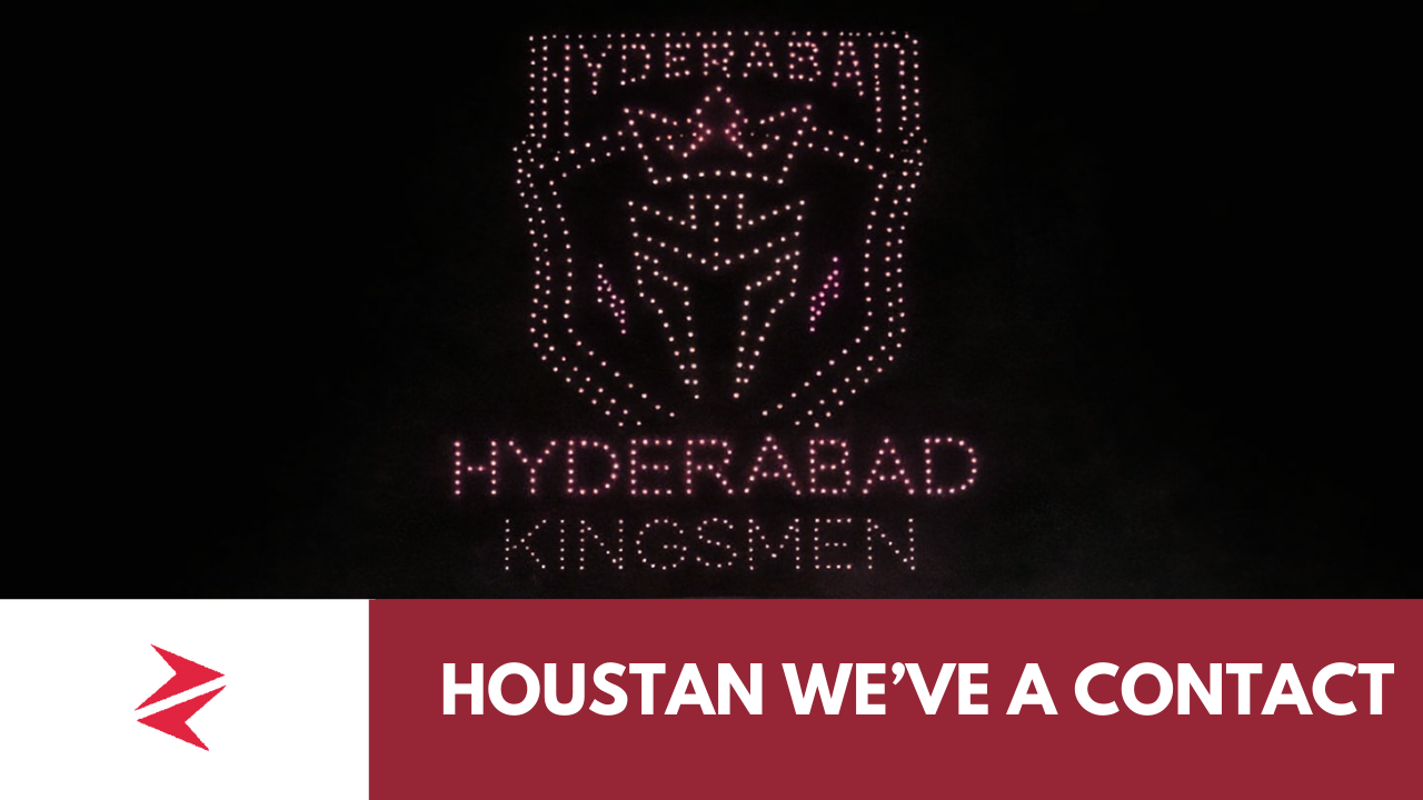
At Niaz Stadium, amid the largest drone show ever used for a franchise unveiling, the gold-and-black crest of Hyderabad Houston Kingsmen lit up the sky. A crowned warrior helmet. A sharp shield. High polish. High budget.
And for a noticeable section of the audience, a familiar unease.
The Freemasonic Question — Perception Matters More Than Intent
Multiple users independently pointed out the same thing:
the logo’s geometry, crown placement, shield symmetry, and helmet silhouette carry a Freemasonic / secret-order aesthetic.
This is important to clarify carefully.
No one is alleging affiliation.
No one is claiming intent.
What is being stated—and repeatedly—is perception.
In South Asian sporting culture, symbols are read emotionally, not academically. When a logo leans heavily into occult-adjacent, order-of-elites, or secret-society visual language, it risks alienating audiences who prefer folk, regional, historical cues over globalized “luxury power” branding.
Hyderabad’s visual memory is not Spartan helmets.
It is poetry, bazaars, craft, resistance, and rhythm.
That mismatch is what people are reacting to.


One user summed it up bluntly: “Logo bhi change hona chahiye, ajeeb vibe hai.”
The False Binary: “Fans Cheered, So It Worked”
Yes—fans cheered at the reveal. Drone shows do that.
Spectacle always gets applause.
But applause is not endorsement.
The same night, social platforms were flooded with: